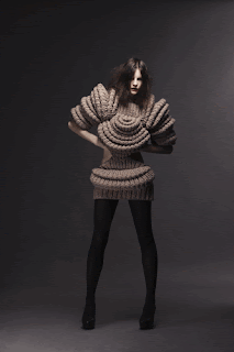
Where have I been? Under a rock? How could I have possible missed this woman and her work!? I came across her on Cubist Literature!'s Flickr page and from there found SandraBacklund.com which you should ALL check out because it's fantastic! Her current collection is beautifully feminine, but has a strange floral/insect/sci-fi vibe to it.

I find it incredibly compelling both visually and technically. Each piece has its own structure and design that is completely unique to her work. I think that they are compelling images for any person, regardless of their level of fiber-obsession. (Who, me?) Personally I find that they lead my mind towards some sort of tribal armor, but not to the point that they're kitschy or obvious, just refreshing and powerful.

"My work is very personal to me. I improvise and allow myself to lose control and see what happens if I do not think so much about practical things."
-Sandra Backlund
If that's not inspiring, I don't know what is.
![Soasa [blog]](http://4.bp.blogspot.com/_Bwz_omap5qI/TLdl4vakkBI/AAAAAAAAAZw/hKoqM3VEbvU/S1600-R/Soasa+ArtFire+Banner.jpg)

6 comments:
Your passion for her work makes me smile. :) After that reaction, my thoughts are extremely unflattering towards the aesthetic. I can admire the technical skill, but for me it's like art yarn. It doesn't matter how cool it is structurally if visually I'm repulsed. So, according the crowd that feels any strong reaction, good or bad, means the artist has succeded, she has succeded.
Different tastes for different folks, if we all liked the same thing I'd have to figh my friend Jenny over the same yarns at Webs. :P
I guess it depends on your background. For me, she's brought in a lot of what I study in metalsmithing, which is totally cool, imo. I don't find them beautiful in a traditional sense, so I suppose the attraction for me is the technical stuff. The problem solving and form building really intrigue me, and the process of ideas as well. It's not so much about the finished object as it is about the process. (Although I will say that I found the blocky ones a bit boring, both visually and technically.)
Well look at that! 3 columns and everything! I am surprised you gave your blog a new name - what with your Soasa designs logo being something you were so sure of. Or are you separating the blog from the whole jewelry aspect of things?
Very proud of you for going ahead and taking the plunge, very appropriate for where you are and what you are doing at this point in your life.
(notice I'm not commenting on the knit designs. Ahem.) :)
Just went back and saw you DID say you were thinking of changing the name. Duh!
Yea, I changed the name because I felt like it wasn't fair to use my business logo on a blog that was so rarely about my business! When I'm back in the swing of things this fall the jewelry will definitely become more prominent and we'll see if anything changes, but at the moment this new title is much more relevant! (hopefully the travel theme will stay relevant! I've definitely been bitten by the bug, that's for sure.)
Post a Comment